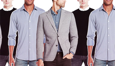
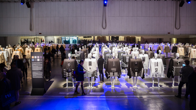
The 2nd edition of Prima Milano Unica and the Fall/Winter 2017-2018 trends
Time for trend moods. Time for ideas. The FW 2017/18 Milano Unica trends were presented at “La Pelota” in Milan to exhibitors and fashion community.
The event, conceived by Stefano Fadda, Art Director of MU, and his staff in collaboration with Antonella Matarrese, renowned fashion journalist, and SGS Architetti Associati, displayed a striking combination of modernity and style. The output is always innovative, highly conceptual, stretching from social culture to the arts and fashion.
Six big players participated in the comparison, each speaking a personal lexicon that combined into a narration of this edition’s trends, giving shape, word and sound to the “sublime side of elegance”: Burri and Piano, Fontana and Hokusai, Albini and Portaluppi.
Stefano Fadda defined elegance as “timeless, beyond trends, soul-satisfying”. A subtle notion. For this reason, to give substance to the harmonious and ephemeral, making concrete reference to these creative geniuses, who went across the boundaries of space and time, was the inspiration for the creation of textiles and accessories in line with the elegance of the finest Italian tradition.
Elegance is timeless. It outlives any fashion and pervades the spirit. Some say that it is innate; others believe it should be taught and learned time after time. Others believe it can be bequeathed. Elegance is a subtle concept. ...It is harmony and purity, precision and sobriety, levity and essence. Elegance is motion, the one created by the artist when he divides the canvas by a sharp cut or by an architect when he draws with his pencil the lines of flight for his project or by the weaver who weighs in his hands a fabric understanding its structure by touch. Elegance is everywhere. In a simple gesture, in nature’s patterns, in the randomness of some events but above all, it is at the heart of man’s creativity.
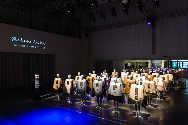
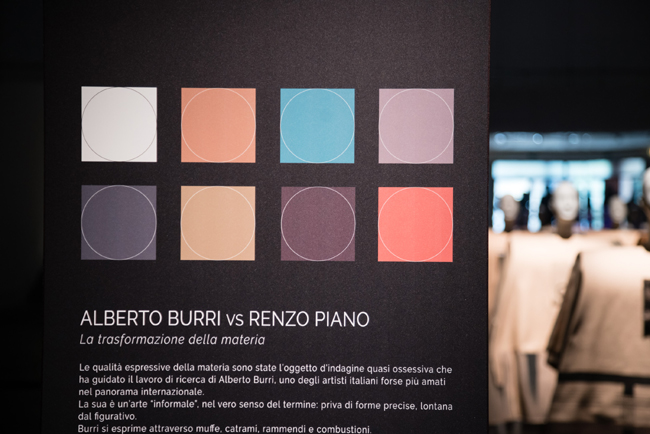
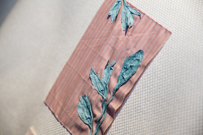
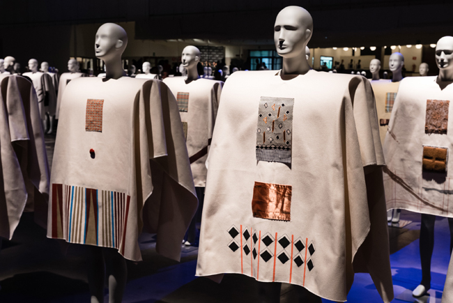
ALBERTO BURRI vs RENZO PIANO The transformation of matter
The expressive qualities of matter have been the object of the almost obsessive research work of Alberto Burri, one of the most beloved Italian artists on the international scene. His art is “informal” in the true sense of the word: no defined shapes, far from the figurative. Burri expresses himself through molds, tars, darning and combustions. The plasticity of matter fascinates him and its transformation provokes him artistically. However, the true core of his poetry is ‘consumption’, namely the evocative power of eroded materials. In contraposition with this abstract, material, shapeless world, Renzo Piano’s one is based on form. Thanks to his humanistic education, Renzo Piano works between tradition and innovation: the idea of the ‘workshop for apprenticeship’, the rediscovery of hand drawing and the development of prototypes made directly inside the architecture firm, are combined with the use of advanced building materials and technologies. However, both Burri and Piano, are bound to the communicative power of the materials their works are made of. Layer-by-layer, they always reveal different aspects, and enrich or transform into something different, as it happens to metals in a furnace, which magically change colours and shapes.
MATERIALS Nothing is as it appears
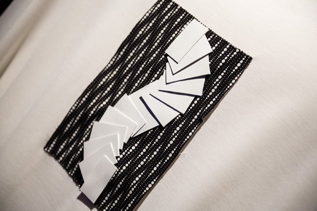
As in art and architecture, even in the world of textiles research quality is sublimated by experimentation.
Double face felt in fine version has been worked with oxidations, charred prints, rubber coatings and overlappings of metallic elements.
Woolen cloths are enriched by directional embossments.
Yarns are proposed both as bouclé enriched with embossed drawings and blackened iron stamps, and peat effect with metal details.
Bouclé is also coppery version with steel ribbons.
Many are the mix of materials such as metal jersey, overlapping super-soft wool and moiré suede, which is as worn out as metals.
Fur, even fake, is super soft and presents wood effect carvings, while leather shearling is reinterpreted with wire mesh and mercury drops.
Denim is luxury version, worked with metal yarn and semi-gloss coatings.
Fancy pattern fabrics struck with their explosion of volumes, macro-pads, irregular pleats, which are characterized by blurred abstract printings, and cast iron and rusted iron effect films.
Cotton is strategically worn out, soft to the touch, with artistic effects as if they were canvas.
Tweed is matched with printed corduroy embellished with chromed stitchings, or is processed with artistic burns or reinvented with textile patterned paddings.
The usual 3D weaves are overturned by mesh/fur inserts, with explosive effect on the fabric.
Shirt fabrics are characterized by planimetric printings, as well as transparencies overlapping heavy materials are inspired by an environmental stratification.
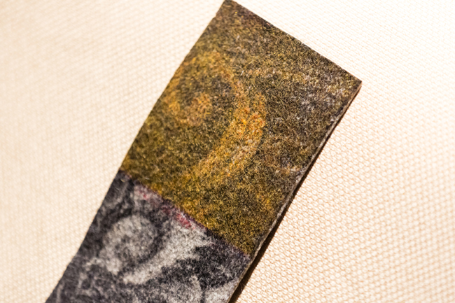
COLOURS The chemistry of metals
In this first theme, the “colour chart” has been inspired by metallic shades. The main colours are simple, ranging from camel to ecru. The gray of metal worn out by time, fire and water creates new colours, ranging from shades of green, characteristic of oxidation, to purple and to rust, symbol of time wearing.
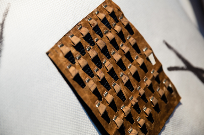
ACCESSORIES Material Architectures
It seems that nearly three-dimensional materials take architectural forms. The material inspiration of this theme gives interesting ideas for accessories that in the field of embroidery use metallic processing techniques for felt manufacturing.
Edgings are precious and modern and seem to be animated by metal exposed weaves.
Metal weaves themselves are combined with cracked glass effects in order to the realize tags and labels that assume a three-dimensional shape.
The glass effect, a theme very dear to Renzo Piano, is reproduced both in buckles and in decorations.
Labels are also more matter like and present plating overlappings on materials such as leather and paper that simulate the erosions typical of Burri’s metalworking.
Copper wire becomes macramé overlapped to natural materials, with architectural patterns.
Buttons and decorations are large, with irregular shapes and often mixed with fabric thanks to the metallic shadows of plastic materials.
Edging are bulky, rich and made out of fancy yarns.
Zippers, characterised by oxidised or blackened plating, are embellished by burned and torn out ribbons, made out of fine yarns.
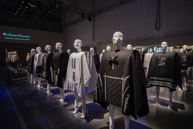
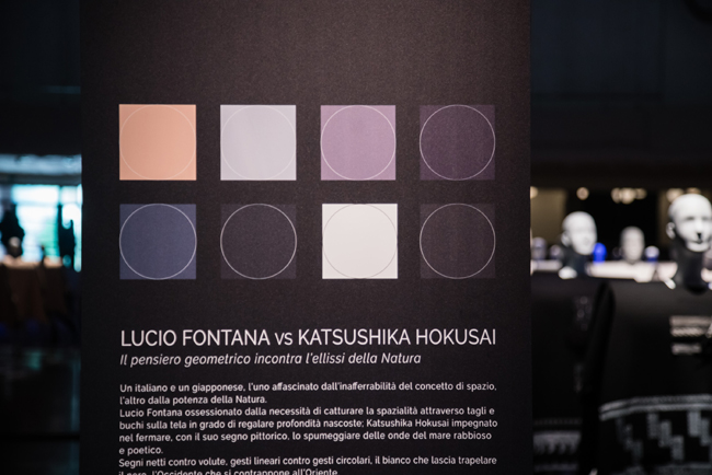
LUCIO FONTANA vs KATSUSHIKA HOKUSAI Geometrical thinking meets the ellipses of Nature
An Italian and a Japanese, one fascinated by the elusiveness of the concept of space, the other by the power of Nature. Lucio Fontana, obsessed by the need to capture space through cuts and holes on canvas that can offer hidden depth; Katsushika Hokusai involved in stopping, with its painting style, the foam of the waves of raging and poetic seas. Sharp cuts against spirals, linear gestures against circular gestures, the white that betrays black, the West as opposed to the East.
They both want to grasp a unique concept: the form of things, both the abstract and the concrete ones. In this case, colour shades are not necessary, as colours may not overcome the essence of forms. The physicality of the gestures performed by the artists makes their works great besides the formal representation of their subjects. In this view, then, the focus of this last theme consists in the experimentation of geometric, three dimensional, graphic, full and empty forms, combined with the idea of contact with matter. Fabrics and accessories with their sophisticated, elaborated and overlapping shapes have a strong tactile value. And to achieve this synthesis that would befit form, a “purification” of the colours chart has been necessary, a reduction in the chart to alpha and omega of colours: white and black. That is the primary combination of timeless elegance.
MATERIALS Italian craftsmanship and Japanese refinement
By overlapping Fontana’s style to the artistic gesture of Hokusai, without forgetting the typical Japanese silhouette of clothing, it’s easy to identify the circular, elliptic patterns and the colour duality that have inspired the variations of fabrics and accessories of the collection. The concept of three-dimensionality obtained by material overlappings has inspired back printed fabrics, double face raw laser cuts, embossed cloth, carded selvedge overlays with paddings and carved textile.
Jacquard in this theme, is proposed with glossy and matte games, combined with the typical kimono patterns, with needle loom ribs and transparency effects.
Heavy-duty textiles for outerwear present hair effects with glossy and matte games, fine yarns mixed with synthetic metallic threads, short-haired fabrics with flat woven patterns or contrasting vinyl spotted prints.
Many tone on tone moulinè jersey fabrics are proposed for knitwear.
Fancy patterns realised with fil coupé, show Japanese inspired influences, while laces are decorated with geometric glossy/matte drawings and decorations in gold satin.
Shirt fabrics have scribble effects, interrupted pinstripes and geometric weave games.
COLOURS The lack of colour shades is the essence of elegance
The idea of “purified colour” is translated into a chart of whites and blacks, where black is both gloss version, like oriental lacquers and matte like paintings on canvas. The presence of ancient gold and silver in the colour chart are memories from the past, as if it were the recollection of a precious piece arrived from Japan and of which only the golden line or the silver detail have been evoked. Dark purple, as well as gray, are different shades of black depending on light intensity.
ACCESSORIES Macro elements as precious as jewels
Fontana’s ellipses and ovals, as well as the shapes of ancient kimonos, give substantial inputs for the research of new shapes in accessories, where buttons become giant and present lacquered finishings.
Fontana’ slashes or Hokusai’s wavy patterns have inspired the production of embroideries and laser-cut decorations.
Decorations and ribbons present stylized patterns, alternating stripes and glossy and matte macramé.
Zippers, as well as zipper-pullers, are edged with velvet and metallic lace, memories of a glorious past deprived of colours.
Labels and tags are laser-cut with scribble patterns and have metal decorations.
Fastenings are sumptuous and are inspired by kimono’s ones, and are decorated with pins and damask satin.
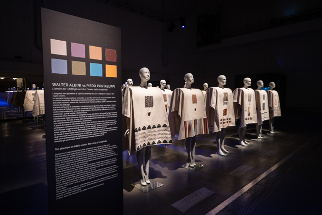
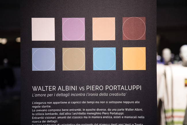
WALTER ALBINI vs PIERO PORTALUPPI The attention to details meets the irony of creativity
Elegance isn’t unpredictable but at the same time isn’t subject to stale rules. This had been well understood, though in different times, by Walter Albini, the Lombard fashion designer, and by the Milanese architect Piero Portaluppi. Both visionary, lovers of classical style but with a heretical touch, aesthetes and manic in detail research. Albini, the spokesman of the glamourous aesthetics of the twenties and thirties, of Hollywood’s charm and Scott Fitzgerald’s novels class, rewrote the rules of modernity, by leaving fashion houses and translating sophistication into industrial production, that is to say by making it serial and democratic. On the other hand, Piero Portaluppi has taught great middle-class families the irony of living, by introducing in their homes modern elements mixed with the elegant silhouettes of non-floral liberty, and by using a creative rationalist, fully Italian style, free of frills, with powerful connotative elements and a lot of irony.
The genius of these two great creative talents has suggested the third theme of Milano Unica, which becomes the mouthpiece of an elegance sumptuous but irreverent, classical but not arrogant.
Portaluppi‘s diamond pattern floors have inspired the study of new printings, while Albini‘s love for jersey has urged the new research of the great potential of this fabric. The carvings of the architect’s wood panelling has influenced chiselled fabrics or accessories embroideries, while Albini’s passion for furnishing fabrics explains the reinterpretation of tapestry in relation to jacquard. In short, ideas are many and the subject is broad and fascinating.
MATERIALS Sumptuous but with a rebel allure
Albini’s richness in details encounters the more industrial-like one of Portaluppi. It is from the overlap and the contrast of these two worlds that a new and sophisticated aesthetics takes life and is sublimated in fabrics that seem to be chiselled.
The large braided knitwear have giant fish thorns on woollen cloth for coats.
Shaved sections on the cloth define geometric patternings tone on tone.
Original pied-de-poule present alternating embossed and flat patterns in order to draw geometric blocks.
Macro frame paddings enhance fine yarns textiles.
Jersey is covered with lace and lacquered decorations, or is enriched with printings reminding metal carvings. Fur is matched with velvet to produce a rich double face effect both outside and inside the garment, like a wardrobe of past times.
The extremely soft fake fur is made of stretch jersey.
Velvet, the star of this theme, is made of silk or viscose, pleated with printing effect, needle felt, needle cord both thin and large and back printed devoré, decorated with embroidery and patternings.
Check games with blurred lines, as if they were covered by a blanket of fog, are combined with micro and macro frameworks.
Tapestry patterns define jacquard fabrics.
Degradé nuanced diamonds patterns on silk shirt fabrics have very clear colour shades, such as graphic patterns games, vijelle yarn-dyed and overprinted and are overlapped to stripes, sticks and pinstripes to obtain an embossed paper effect.
COLOURS The fluidity of nuances
Imagine watching the colour chart through a blanket of smoke. Everything looks slightly as faded and elusive as some memories are.
Halftones of beige, green and light blue, play the leading role. They are subtle nuances, but with a strong character at the same time, inspired by Albini and Portaluppi’s archives. They are slightly faded colours but with a strong visual impact.
ACCESSORIES Back to bon-ton with a bit of irony
Satin becomes an element of contrast with tissues, creating games of materials.
Belts are embellished by refined bows.
Band zippers are classic with clean lines.
A set of patterns decorations macro blocks and buttons enrich pied-de-poule and micro-herringbone fabrics on the trimmings.
The buttons are made of glossy materials, cut like double coloured diamonds.
Buckles are lacquered, colourful and imaginative, overly large, rich and sophisticated as true stars of the garment.
Micro and macro spheres, bows and jacquard patternings decorate tags.
Photos and information: milanounica.it
Hits: 6322 | Leave a comment
About the Author

Boyana Ivanova
Boyana is following men`s trade fairs and exhibitions. She is also covering fashion industry news, best dressed section, lifestyle and trends.