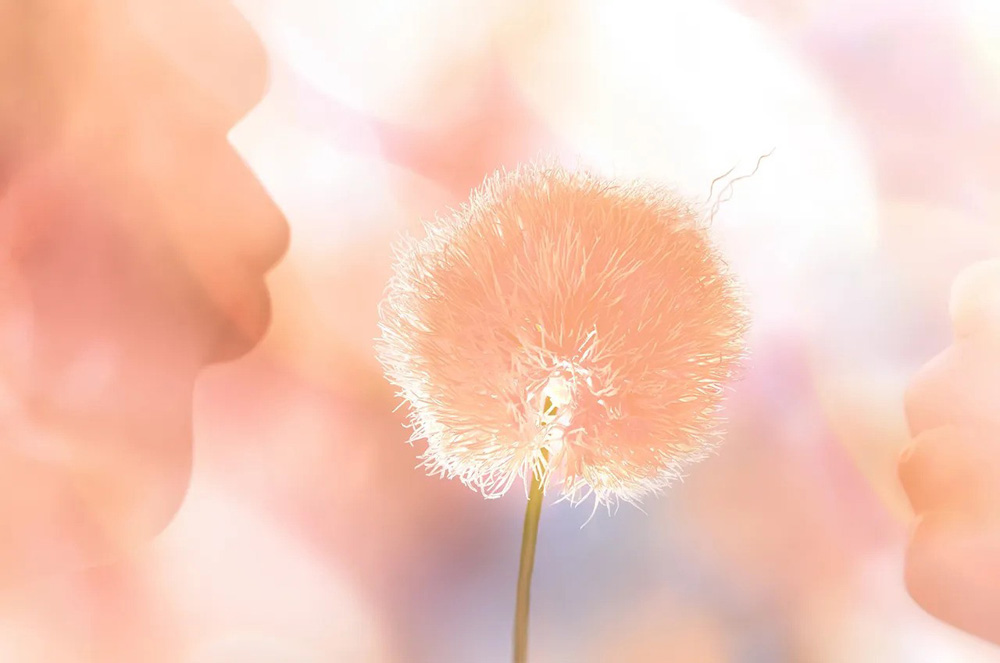
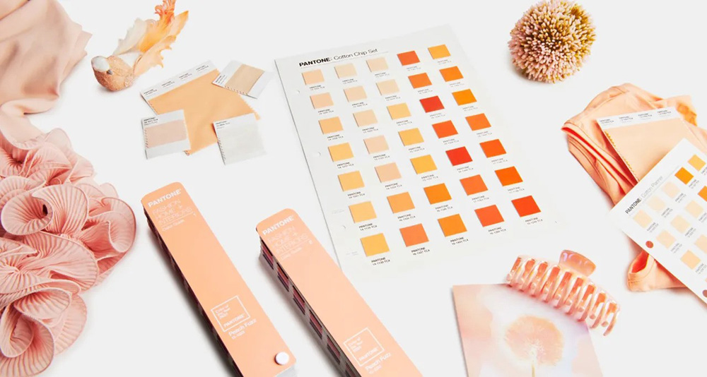
PANTONE color of the year 2024 is the gentle peach tone Peach Fuzz
PANTONE color of the year 2024 is 13-1023 Peach Fuzz. It's a velvety gentle peach tone whose all-embracing spirit enriches mind, body, and soul. It captures our desire to nurture ourselves and others.
"In seeking a hue that echoes our innate yearning for closeness and connection, we chose a color radiant with warmth and modern elegance. A shade that resonates with compassion, offers a tactile embrace, and effortlessly bridges the youthful with the timeless", says Leatrice Eiseman, Executive Director, Pantone Color Institute.
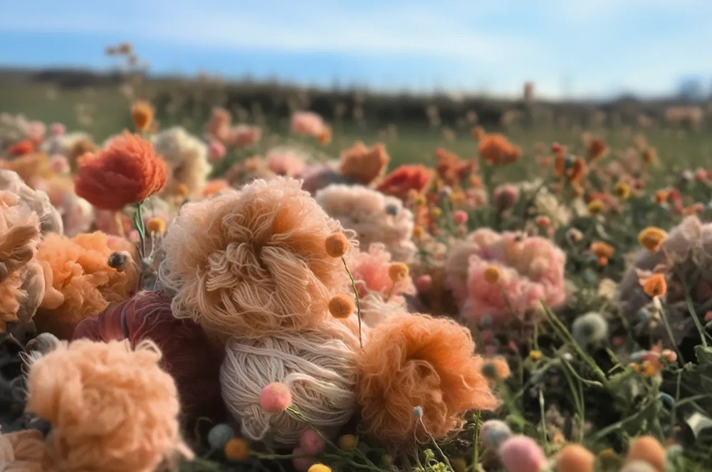
Subtly sensual, PANTONE 13-1023 Peach Fuzz is a heartfelt peach hue bringing a feeling of kindness and tenderness, communicating a message of caring and sharing, community and collaboration. A warm and cozy shade highlighting our desire for togetherness with others or for enjoying a moment of stillness and the feeling of sanctuary this creates, PANTONE 13-1023 Peach Fuzz presents a fresh approach to a new softness. An appealing peach hue softly nestled between pink and orange, PANTONE 13-1023 Peach Fuzz inspires belonging, recalibration, and an opportunity for nurturing, conjuring up an air of calm, offering us a space to be, feel, and heal and to flourish from. Drawing comfort from PANTONE 13-1023 Peach Fuzz, we can find peace from within, impacting our wellbeing. An idea as much as a feeling, PANTONE 13-1023 Peach Fuzz awakens our senses to the comforting presence of tactility and cocooned warmth. Sensitive but sweet and airy, PANTONE 13-1023 Peach Fuzz evokes a new modernity. While centered in the human experience of enriching and nurturing the mind, body, and soul, it is also a quietly sophisticated and contemporary peach with depth whose gentle lightness is understated but impactful, bringing beauty to the digital world. Poetic and romantic, a clean peach tone with a vintage vibe, PANTONE 13-1023 Peach Fuzz reflects the past yet has been refashioned with a contemporary ambiance.
Why Was Peach Fuzz 13-1023 selected to be the Pantone Color of the Year 2024?
At a time of turmoil in many aspects of our lives, our need for nurturing, empathy and compassion grows ever stronger as does our imaginings of a more peaceful future. We are reminded that a vital part of living a full life is having the good health, stamina, and strength to enjoy it. That in a world which often emphasizes productivity and external achievements, it is critical we recognize the importance of fostering our inner selves and find moments of respite, creativity, and human connection amid the hustle and bustle of modern life. As we navigate the present and build toward a new world, we are reevaluating what is important. Reframing how we want to live, we are expressing ourselves with greater intentionality and consideration.
Recalibrating our priorities to align with our internal values, we are focusing on health and wellbeing, both mental and physical, and cherishing what’s special — the warmth and comfort of spending time with friends and family, or simply taking a moment of time to ourselves. With that in mind, we wanted to turn to a color that could focus on the importance of community and coming together with others. The color we selected to be our Pantone Color of the Year 2024 needed to express our desire to want to be close to those we love and the joy we get when allowing ourselves to tune into who we are and just savor a moment of quiet time alone. It needed to be a color whose warm and welcoming embrace conveyed a message of compassion and empathy. One that was nurturing and whose cozy sensibility brought people together and elicited a feeling of tactility. One that reflected our feeling for days that seemed simpler but at the same time has been rephrased to display a more contemporary ambiance. One whose gentle lightness and airy presence lifts us into the future.
How to Use the Pantone Color of the Year 2024
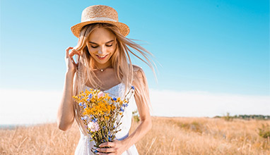
PANTONE 13-1023 Peach Fuzz in Apparel and Accessories
Visually arresting and inviting, PANTONE 13-1023 Peach Fuzz is a nurturing peach tone that inspires us to instinctively want to reach out and touch. Conveying a message of tactility that comes through in sueded, velvety, quilted, and furry textures, luxuriously soothing and soft to the touch, PANTONE 13-1023 Peach Fuzz is an enveloping peach hue that awakens our senses to the comforting presence of tactility and cocooned warmth.
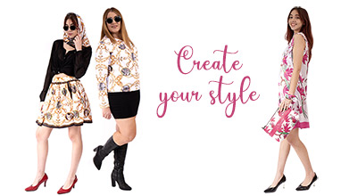
Where to find clothes in Pantone Color of the Year 2024
If you can't find items that you like in this color, the brand Nixita Dress to Impress can help you create your clothes and accessories in this beautiful color. Peach Fuzz color has code #FFBE98 and Nixita can print it on your clothes together with your photos, drawings, paintings or illustrations. Learn more at https://www.dress-to-impress.com/
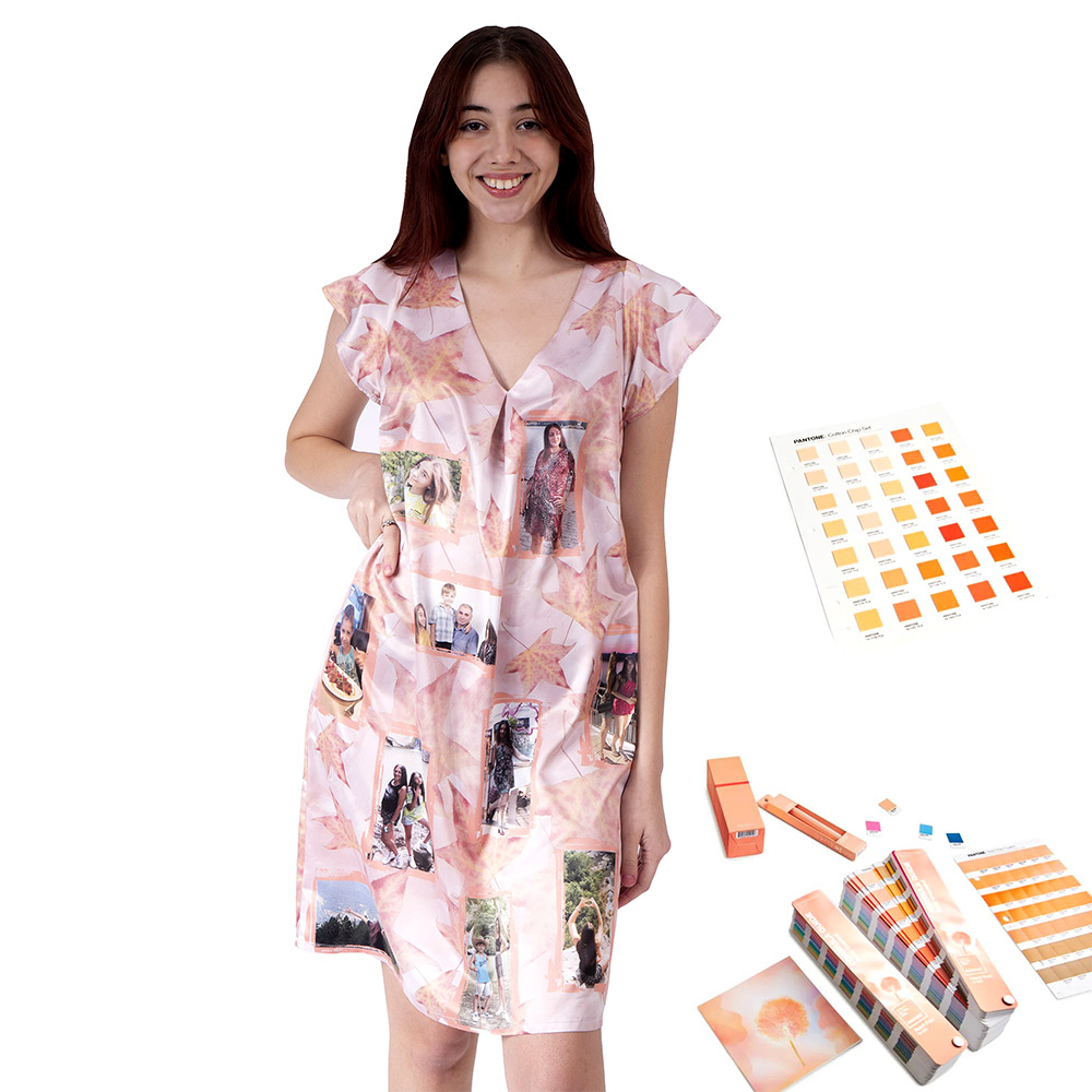
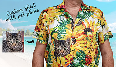
Photo: Custom dress with client's photo
PANTONE 13-1023 Peach Fuzz in Interior Design and Home Décor
Introducing soft and cozy PANTONE 13-1023 Peach Fuzz into home interiors creates a welcoming ambiance. Promoting feelings of gentle warmth whether appearing on a painted wall, in home décor, or acting as an accent within a pattern, PANTONE 13-1023 Peach Fuzz infuses our most personalized worlds with a comforting presence.
Peach Fuzz 13-1023 in Hair and Beauty
A contemporary peach with depth whose gentle lightness is understated, Peach Fuzz 13-1023 adds an ethereal, reflective finish to hair and creates a natural rosy glow flattering complexions across a large variety of undertones.
A surprisingly versatile shade, Peach Fuzz 13-1023 enlivens the skin, adding soft warmth to eyes, lips, and cheeks making all who wear it appear more healthy. Fresh and youthful when paired with earthy browns and dramatic when paired with deep reds and plums, the Pantone Color of the Year 2024 opens the door to a wide assortment of lipstick, blush, skin tone, and contouring options
Expressing a message of tenderness, nail designs incorporating Peach Fuzz 13-1023 are romantic, innocent, and sweet.
PANTONE 13-1023 Peach Fuzz in Packaging and Multimedia Design
A clean peach tone with a vintage vibe, PANTONE 13-1023 Peach Fuzz reflects the past yet has been refashioned to have a contemporary ambiance, enabling it to seamlessly display its presence in both the physical and digital world.
Seemingly tactile, PANTONE 13-1023 Peach Fuzz welcomes consumers to reach out and touch. Its warm tactility makes it an enticing shade for a variety of products, from food and beverage to cosmetics and accessories. Inspiring thoughts of sweet and delicate tastes and scents, PANTONE 13-1023 Peach Fuzz tempts the taste buds with thoughts of sweet and delicate scents and treats.
How Does Pantone Select the Pantone Color of the Year?
An Interview with Laurie Pressman, Vice President of the Pantone Color Institute
Laurie, talk about why and how this process began. When did Pantone Color of the Year start?
The Pantone Color Institute originally created the Pantone Color of the Year educational program in 1999 to engage the design community and color enthusiasts around the world in a conversation around color. We wanted to draw attention to the relationship between culture and color — to highlight to our audience how what is taking place in our global culture is expressed and reflected through the language of color.
In 2024, Pantone Color of the Year turns 25. Do you have any thoughts on this? How has its legacy grown in the last 25 years?
Through the years the Pantone Color of the Year program has become a globally iconic cultural touchstone, capturing the imagination of so many designers, brands, and consumers.
As we celebrate the 25th year of our Pantone Color of the Year program and the fundamental role color plays in our shared human experience, it is our hope that we have inspired you to look at color in a different way — that color and its connection to emotion and the expression of human feelings will take on a new significance, causing your eye to linger a little longer throughout the day on the tints and tones that surround you, as history unfolds from moment to moment.
Since we introduced PANTONE 15-4020 Cerulean Blue as the first Pantone Color of the Year in 1999, we have seen this program influence product development and purchasing decisions in nearly every industry and country around the world. Growing in popularity each year, its impact is felt across fashion, color cosmetics, home furnishings, automotive and industrial design, as well as product, packaging, multimedia design, and commercial interiors. We are grateful to have provided an avenue where designers and color enthusiasts all over the world feel empowered to tell their own stories through the language of color and showcase their creativity within their communities. We look forward to continuing this for many more years to come.
Who decides the Pantone Color of the Year?
Graphics showing examples of previous Pantone Colors of the Year to illustrate how Pantone Color of the Year is chosen.
To arrive at the selection each year, our team of global color experts at the Pantone Color Institute comb the world looking for new color influences. This can include the entertainment industry and films in production, traveling art collections and new artists, fashion, all areas of design, aspirational travel destinations, new lifestyles, playstyles, or enjoyable escapes, as well as socio-economic conditions. Influences may also stem from new technologies, materials, textures, and effects that impact color, relevant social media platforms, and even upcoming sporting events that capture worldwide attention.
Anything and everything taking place in our culture during the year can influence our Pantone Color of the Year selections, with each source carrying a different weight from year to year depending on what’s taking place in our culture at that time. For example, if you look back to 15 years ago, technology would have played an infinitesimal role. Today that is no longer the case. Gaming, social media, augmented and virtual reality, and physical design itself are all influenced by our technology and the colors we can access in the digital environment.
How does the selection process work? How does Pantone decide the Color of the Year every year?
The Pantone Color of the Year selection process entails thoughtful consideration and trend analysis. It is a culmination of the macro-level color trend forecasting and research that the global team involved with the Pantone Color Institute conducts year-round that informs this selection, as well as the colors that get included into our color trend forecasting products.
We approach our color selection in a very pure way. No one on our global team comes to any Pantone Color of the Year discussion with a commercial agenda or personal preferences. Instead, we each approach our Pantone Color of the Year color selection in a very pure way. As we like to say, “we love all of our colors equally.”
There’s also a misconception that we gather a bunch of color influencers in a room one day and emerge with the decision. As many of our Pantone Color Institute team members own their own design studios, contribute to key influential global trend forecasts, work with clients prescribing color choices for brand or product visual identity, and even teach classes on color, their daily conversations are rooted in color and design, including material and surface finish.
As a result, conversations relating to the Pantone Color of the Year selection do not take place in one isolated meeting at a specific time of year. It is one long, continuously flowing conversation among a group of color-attuned people. Our Pantone Color Institute team members come from a wide range of design, cultural, and geographical backgrounds. The commonality that brings them together is their expertise in color and design, and their ability to see the world through the lens of color. That’s why I liken them to being color anthropologists. They have this intuitive ability to connect all that is taking place in the world and translate it into the language of color.
What’s especially fascinating to me about the Pantone Color of the Year selection process is that although our Pantone Color Institute members reside in disparate locations and are involved in differing areas of design, we are always able to come to a consensus.
Sure, there are different perspectives that come up and we carefully look at them all, but because the Pantone Color of the Year reflects what is taking place in our global culture at that moment in time, many of our observations and what we see visually showing up can be quite similar. We discuss our color psychology and color trend research as we look to connect the mood of the global zeitgeist with the corresponding color family. From there, we drill down further to identify the exact right shade.
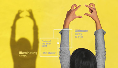
It is always a challenging process and sometimes we need to look at alternative ways to express our color message. For Pantone Color of the Year 2016 and Pantone Color of the Year 2021, we brought together two colors to tell our story.
PANTONE Color of the Year 2016 was a blend of two shades, PANTONE 13-1520 Rose Quartz and PANTONE 15-3919 Serenity, that came together to reflect connection and wellness as well as convey a soothing sense of order and peace.
For Pantone Color of the Year 2021, our two independent colors, PANTONE 17-5104 Ultimate Gray + PANTONE 13-0647 Illuminating, highlighted how different elements come together to support one another.
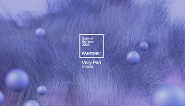
And, for the first time for our Pantone Color of the Year selection in 2022, PANTONE 17-3938 Very Peri, we created a brand new color as we did not have the exact right color we needed to convey the message.
We also consider the color name in our selection process as names immediately conjure up an image and a feeling. We want to make sure that the name of our Pantone Color of the Year resonates and can easily and intuitively convey the message we are looking to send.
Graphics showing examples of previous Pantone Colors of the Year to illustrate how Pantone Color of the Year is chosen.
What does the selection of the Pantone Color of the Year represent?
The color we select to be our Pantone Color of the Year is bigger than one region or one sector of design. It is a color we see crossing all areas of design — a color that serves as an expression of a mood and an attitude on the part of consumers, a color that will resonate around the world, a color that reflects what people are looking for, a color that can hope to answer what people feel they need.
That’s the difference between a more short-lived fad and a lifestyle trend. Pantone Color of the Year is reflective of a lifestyle trend. It’s about what’s happening in the zeitgeist at a macro level. It's not going to represent a singular trend that you can only find in the US or only find in Asia. It’s global.
The emotional aspect of color is also a large aspect of our decision making. We want to ensure that the colors we select reflect what is taking place in our global culture at a specific moment in time. With color and context so intertwined, there really are reasons why a color family or individual color comes into prominence when it does. For the most part, the popularity of a color is symbolic of the age we live in. So, while each year is unique, and we look at each year separately, we also do look back to where we have been since we began this program in 1999.
Why does Pantone pick the Color of the Year? In other words, what makes the Pantone Color Institute the global authority on color?
Pantone is in the business of color. Since 1963, Pantone has provided color solutions for all our client’s color needs. Today, Pantone’s color language is used by designers worldwide to access color trends, communicate color choices, and control consistency of color across every imaginable surface, texture, material, and finish.
Founded in 1985, the Pantone Color Institute educates, inspires, and promotes fluency in the language of color. Executive Director Leatrice Eiseman, who helped to start the Pantone Color Institute, has a background in color, design, and psychology. The ongoing color preference study research which she conducts through the Pantone Color Institute serves as the foundation for who we are and all that we do.
Why is Pantone Color of the Year important? When the program is successful, what happens to the world?
It’s important to remember that the goal of the program isn’t to promote one particular color, although we do see that colors we select to be our Pantone Color of the Year increase in popularity, and once integrated into the cultural mindset, become even more influential the following year.
The goal of the program is to help companies and consumers better understand the power color can have. We want to highlight color’s role as a silent language to teach them how to leverage color’s power and expressiveness to influence perception — whether it be to create a more successful design strategy that will increase consumer engagement, or to better showcase your own personal identity.
For companies, Pantone Color of the Year demonstrates that color is a major part of a consumer’s decision to buy something or not. For consumers, it makes them conscious of the impression they can make through color. On any given day, the colors you choose to wear affect your mood and how you want others to perceive you. Color is an important part of the message you send to the world.
Color is our most important powerful communication tool. It is the first thing we see and the first thing we connect to. It is a visual language we all understand, one whose message crosses genders, generations, and geographies.
Learning more about the unique meanings particular colors give voice to helps us to be a more expressive, closely connected society, one that provides people with a more holistic understanding of their peers and communities alike. As a globally recognized visual language, color can say what words cannot.
Hits: 35422 | Leave a comment
About the Author

Silvia Kabaivanova
As the founder of Be Global Fashion Network and several other fashion websites, Silvia has been working for more than 20 years covering fashion industry trends and news. With a passion for the fashion business, she focuses on sustainable fashion and innovations, custom fashion and print on demand services. Silvia is a Chairman of Bulgarian Fashion Association. You can reach her at silvia@bgfashion.net
Related Articles